The checklist we run before every launch
Forty-two checks, from alt text to the last redirect. Copy it, it is yours.

Luca Brandt
Founder, Creative Director


Most identity projects start with the logo, because that is what everyone wants to see. We start somewhere less exciting: twelve columns, a type scale and a rhythm.
The order of things
A logo is one decision. A grid is the decision that makes the next hundred easier. When the columns, margins and spacing are fixed first, every later choice has something to agree or disagree with, and arguments about taste turn into arguments about structure.
That sounds dry, but it is the opposite. With the structure settled, the team can be bolder with everything else, because the page always holds together.
A grid is the decision that makes the next hundred easier.
Twelve columns
Twelve divides by two, three, four and six. That is the whole trick, and it is enough. A product page, a poster and a slide deck can share one system without anyone noticing the rules.
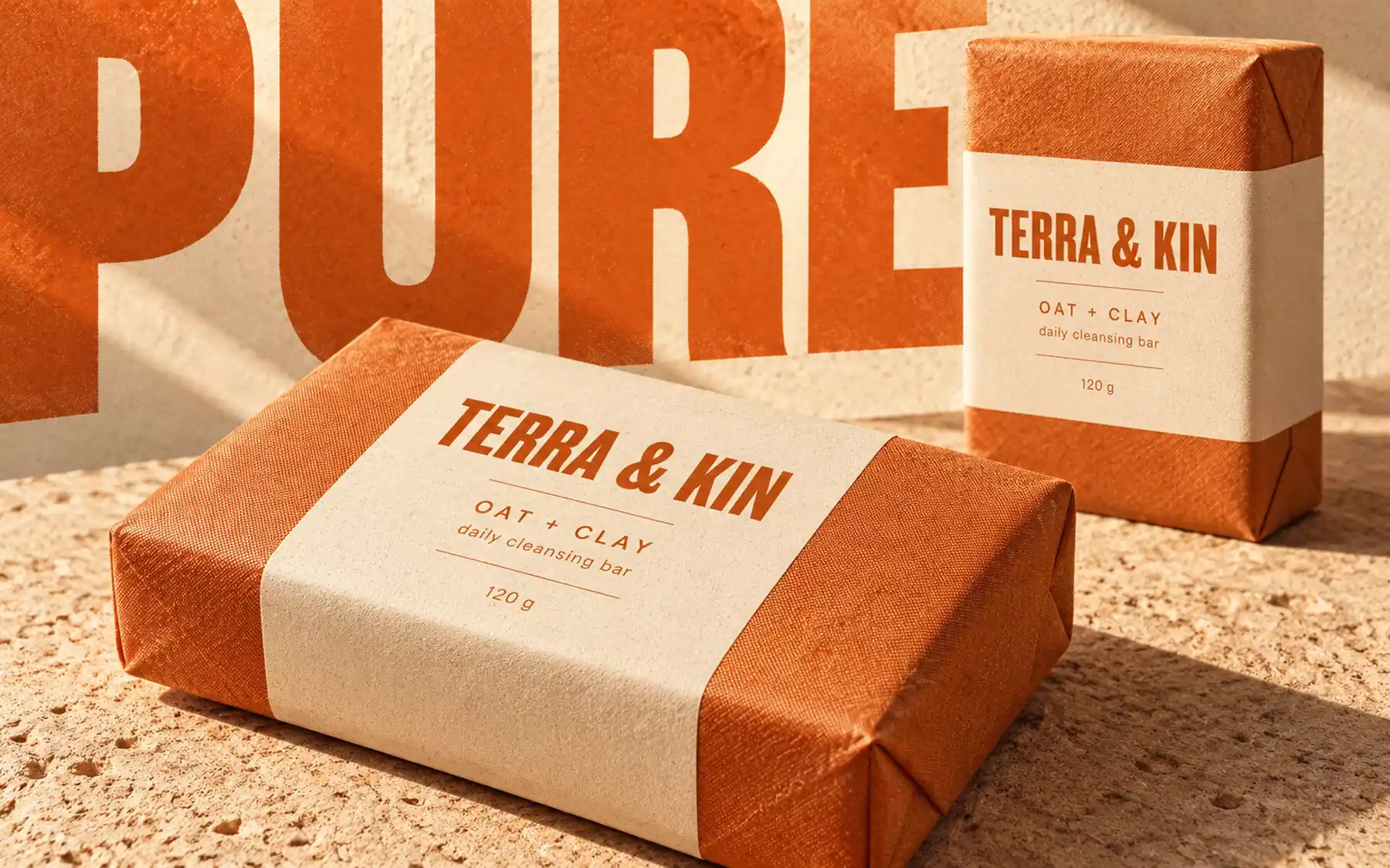
Terra & Kin, 2025: the same twelve columns on a box, a band and a poster.
What we fix in week one
Columns, gutters and margins for every breakpoint
A type scale with six steps and one line-height rule
An 8-point spacing rhythm
One easing curve for every transition
Where the logo lands
By week three the logo has a place to live. It is drawn on the same grid, aligned to the same baseline and animated with the same curve. It stops being a sticker and starts being part of a system.