Clean Theory
Lab-grown skincare rebrand
Client
Clean Theory Labs
Year
2024
Services
Identity, Web, Motion
Result
TDC

(01) Overview
Clean Theory case study by Raster: a warm rebrand for a lab-grown skincare company, with a custom serif and a Type Directors Club award.
A lab-grown skincare company that looked like a lab. We rebranded it to look like something you would want on your shelf.
01 / Challenge
Great science, cold brand. Customers trusted it but did not want it in their bathroom.
02 / Approach
A warm mono palette, a custom serif for headlines and motion that moves like a slow pour.
03 / Result
A Type Directors Club award, and a relaunch that doubled repeat orders.


Fig. 01 to 03
The new brand and the new product share one grid: twelve columns, an 8-point rhythm and one easing curve for every transition.
(02) Client
“They didn't redesign our site. They redesigned how we make decisions about it.”
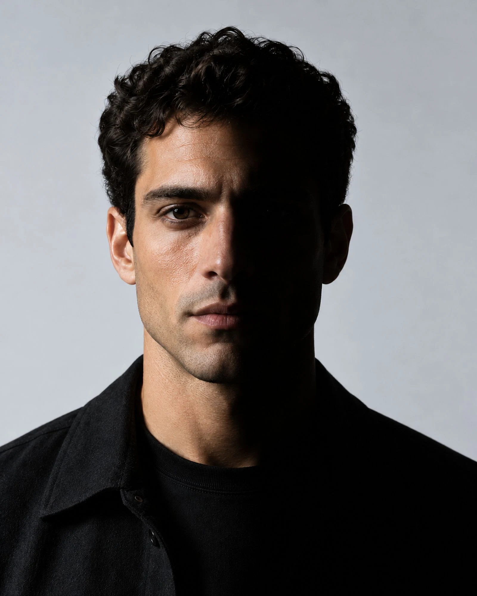
Ade Okafor
Head of Product, Vela
(03) Credits
Four people, ten weeks.

Creative direction
Luca Brandt

Design
Tomás Reyes

Development
Noah Haddad

Motion
Elena Wren
No items


